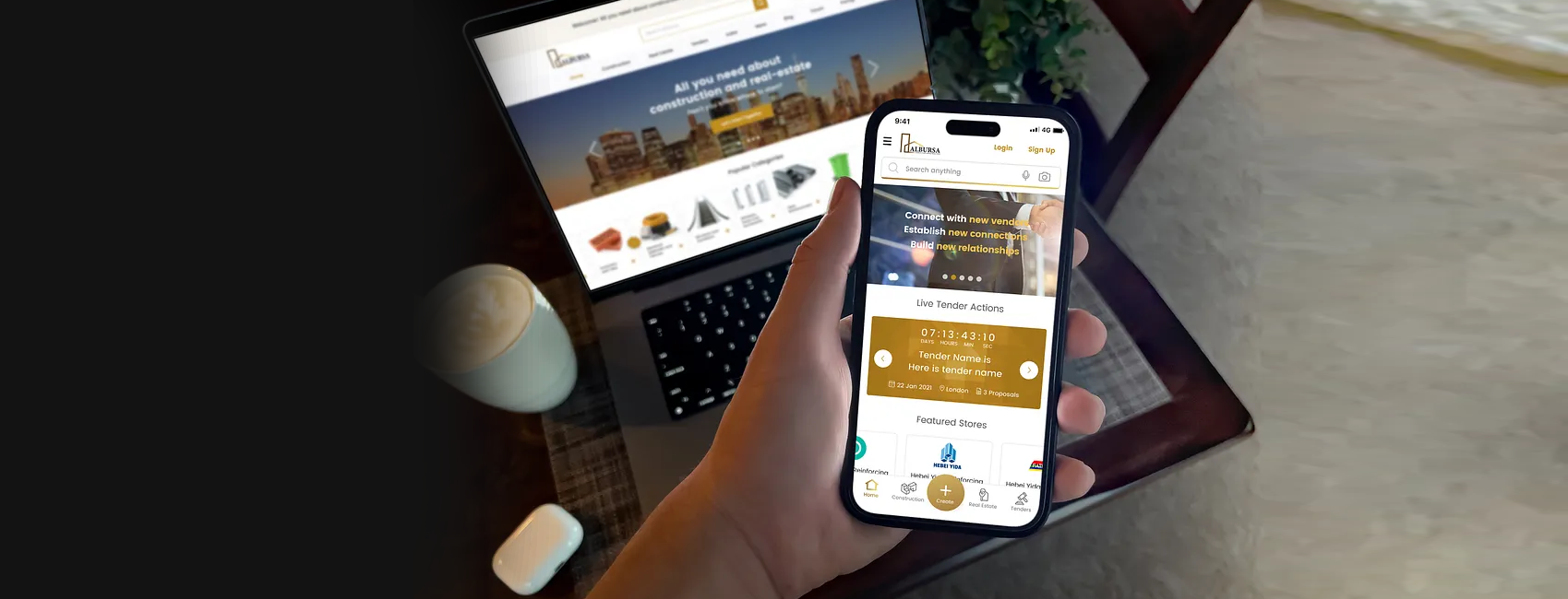
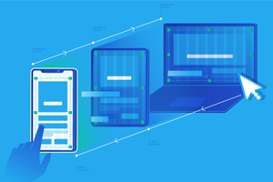
Responsive Design
Layout automatically adjusts to fit any screen size, from phones to tablets to desktops

Fast Loading Speed
Optimized images and code that loads in under 3 seconds, even on 4G networks
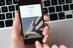
Fast Loading Speed
Optimized images and code that loads in under 3 seconds, even on 4G networks

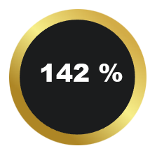
Average increase in mobile conversion rates
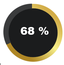
Reduction in bounce rates after mobile optimization
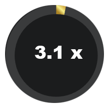
Longer average time spent on site