How to Choose the Perfect Color Palette for Your Website
Selecting the right color palette is crucial for creating a visually appealing and effective website. Colors can evoke emotions, reinforce your brand identity, and guide user interaction. Here’s how to choose the perfect color scheme for your site:
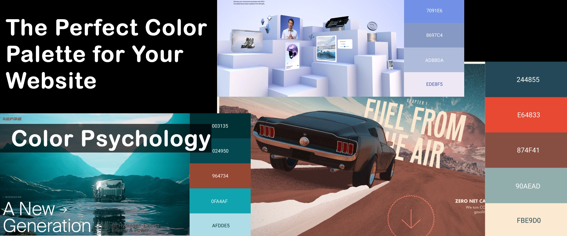
1. Understand Color Psychology
Different colors can trigger various emotional responses:
- Blue: Trust, stability, professionalism
- Green: Growth, nature, health
- Red: Energy, urgency, passion
- Yellow: Optimism, clarity, warmth
- Purple: Luxury, creativity, wisdom
- Orange: Enthusiasm, adventure, confidence
Consider the feelings you want to evoke in your audience when selecting your palette.
2. Reflect Your Brand Identity
Your website’s colors should align with your brand’s personality and values. If you have existing brand colors, use these as a starting point for your website’s palette.
3. Use the Color Wheel
Employ color theory principles to create harmonious combinations:
- Complementary colors: Opposite on the wheel (e.g., blue and orange)
- Analogous colors: Next to each other (e.g., blue, blue-green, green)
- Triadic colors: Evenly spaced around the wheel (e.g., red, yellow, blue)
4. Consider Your Target Audience
Different demographics may respond better to certain color schemes. Research your target audience’s preferences and cultural associations with colors.
5. Ensure Sufficient Contrast
Maintain readability by using contrasting colors for text and backgrounds. This is especially important for accessibility.
6. Follow the 60-30-10 Rule
A balanced color scheme often follows this ratio:
- 60% dominant color
- 30% secondary color
- 10% accent color
7. Test Your Palette
Use tools like Adobe Color or Coolors to experiment with different combinations. Test your choices on sample layouts to see how they work together.
8. Consider Context and Industry Norms
While originality is valuable, be aware of color conventions in your industry. For example, financial sites often use blue to convey trust.
9. Plan for Flexibility
Choose a palette that allows for variation across different pages or sections of your site while maintaining overall cohesion.
10. Don’t Forget Whitespace
Remember that white (or another neutral color) is a crucial part of your palette, providing balance and helping other colors stand out.
By carefully considering these factors, you can create a color palette that not only looks great but also supports your website’s goals and resonates with your audience. Remember, the perfect color scheme balances aesthetic appeal with functional design to create a compelling user experience.